KQED Live Branding
Client | KQED Live team, KQED
Role | Art direction, motion graphics, print and digital design, production
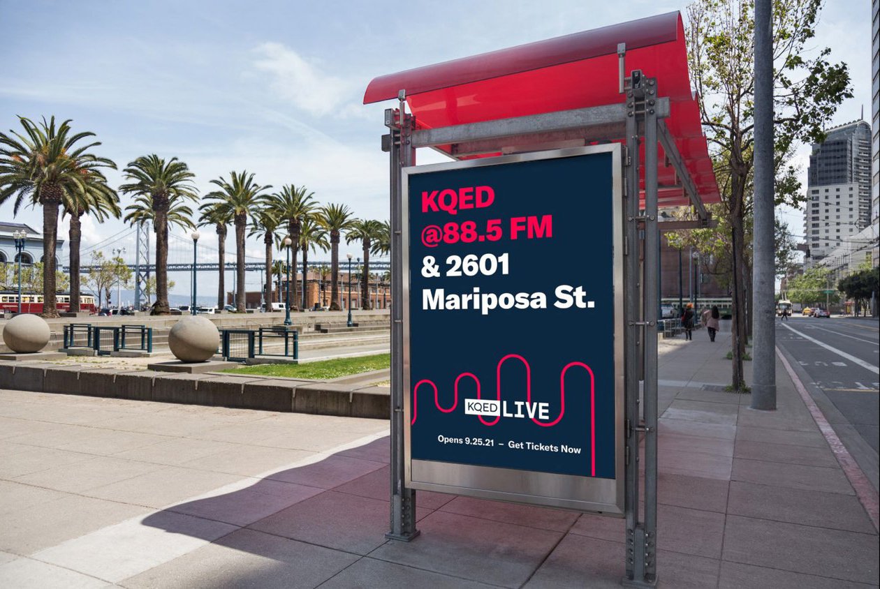
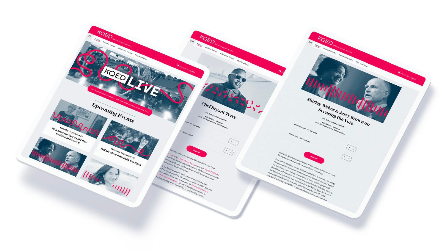
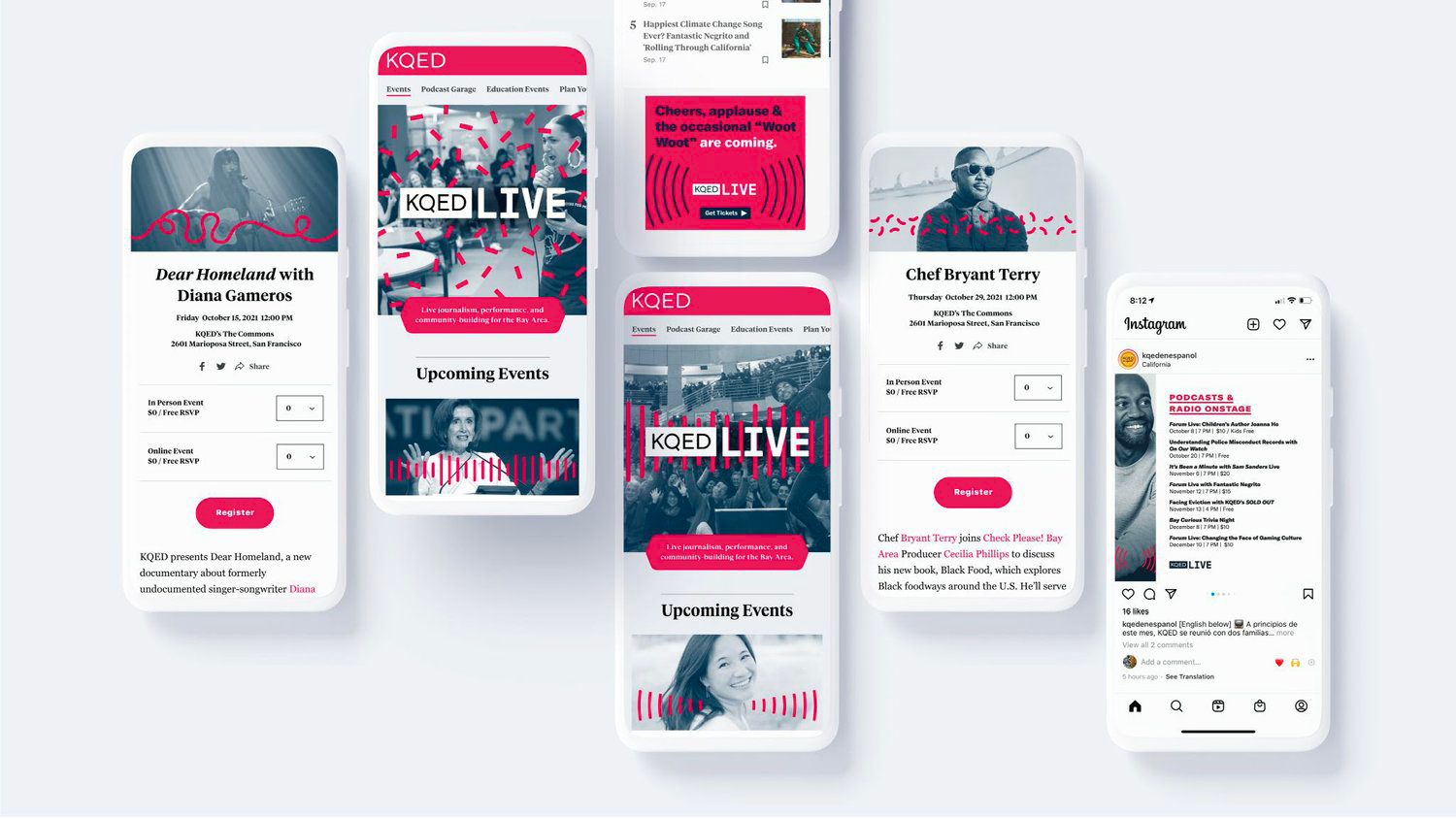
Our internal branding team worked in close collaboration with the KQED Product UI/UX team, KQED Events team, and external agency Division of Labor for strategy and copywriting to develop the brand and visual direction for KQED Live: a brand new events series and venue featuring live shows, discussions with influential figures, and gathering space bringing the diverse Bay Area community together. Together we created a modular system that was initially used in the launch campaign that included large-scale outdoor print and digital ads, and beyond that as the evergreen brand that incorporated minimal line illustration representing the various event genres, combined with stylized duotone photography.
kqed.org/events


Post-rollout Update
Though the core of the brand remained in tact, we were able to evolve and improve some things a bit after rolling it out. We also decided to have different brand colors indicating the seasons, since they were an important distinction in planning and organizing upcoming events. After a few months of the system being implemented, we also received feedback and realized ourselves that the photography was treated a bit too much as a background element, while the “stars” of the shows should really be highlighted more (both to capture attention and the algorithm). In response, we updated the template to allow for the main subject(s) to be isolated in full-color in front of the line graphics, with the background remaining stylized in duotone.


